Le Mother Phoquer
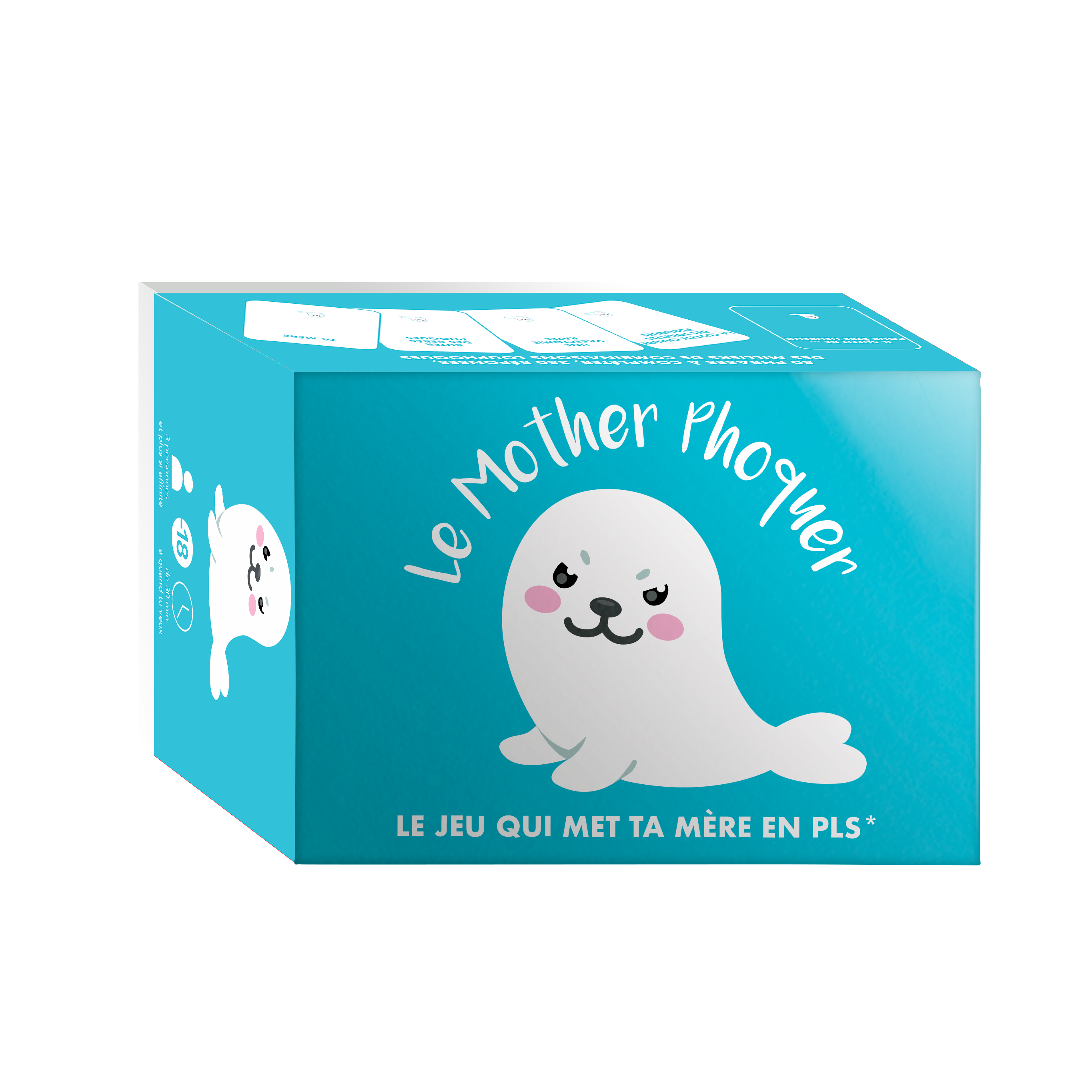
Despite its cute appearance, *Le Mother Phoquer* is a raunchy, gritty, and offbeat party game for adults—perfect for livening up drinks and nights out with friends.
Initially, only the game’s concept and name were defined. My role was to work closely with the team to define the project requirements, including creating the game rules, card content, and mascot design. Ambition: transform this « trash-fun » concept into a product ready to be printed, distributed, and… loved at drinks gatherings.
My mission : to build the entire experience—rules, content, identity, and packaging—and ensure visual and marketing consistency from the initial sketch to the product launch

Artistic Direction
From a play on words to the final product
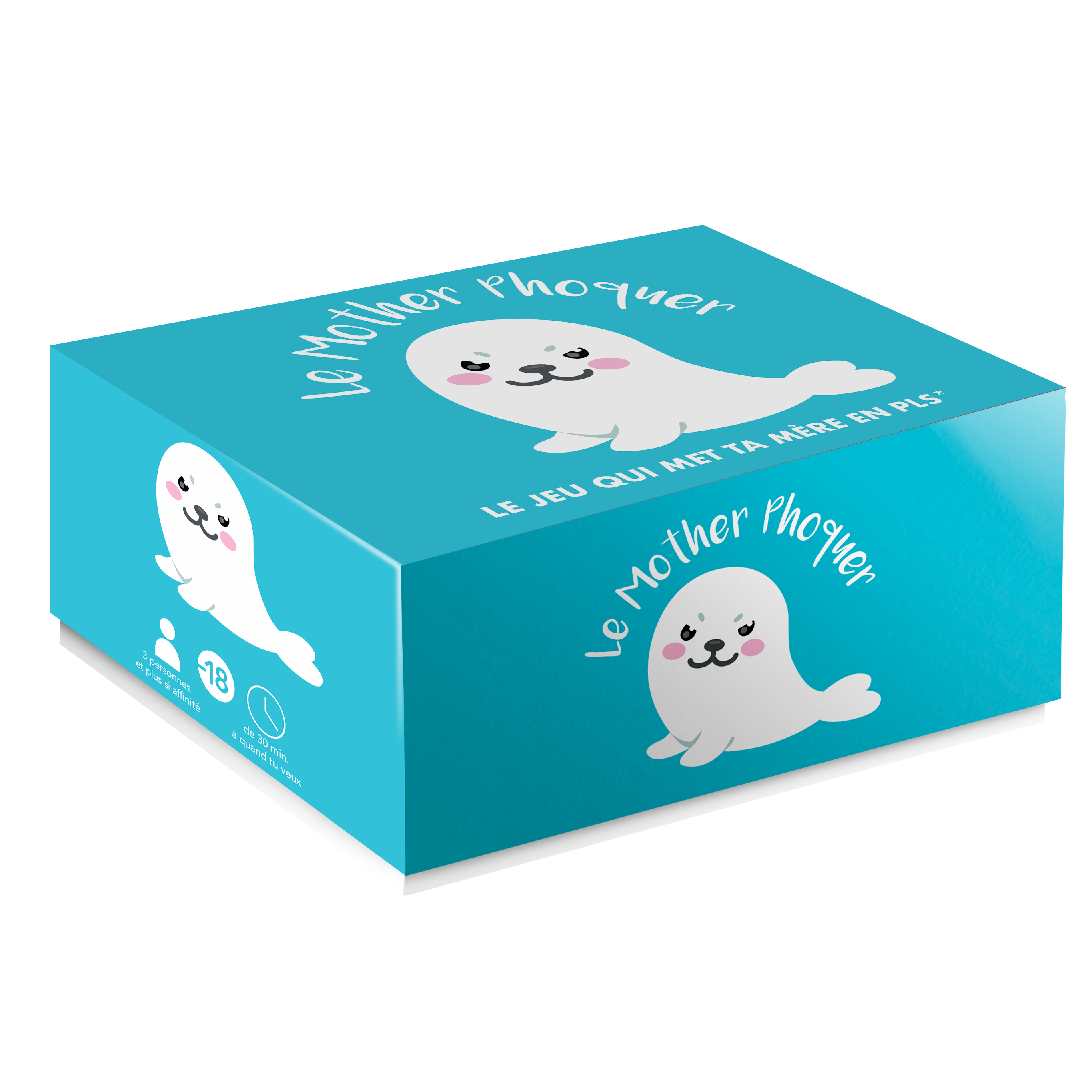
The artistic direction of Mother Phoquer is based on a bold creative choice: create a striking contrast between a deliberately « cute » visual style and game content that is unapologetically trashy and irreverent.
This contrast lies at the heart of the project’s identity. It intrigues and amuses, playing with the audience’s expectations. To achieve this, I devised a colorful, expressive, and almost naive visual world, anchored by a cute, endearing mascot and vibrant hues. The visual style softens the entry into the game’s universe while creating a playful tension with the provocative nature of the cards.
It is precisely this contrast between form and content that gives *Mother Phoquer* its strength: It captures attention, sparks curiosity, and heightens the element of surprise once the game begins.
The visual identity thus becomes a driver of immediate buy-in and strong recall, as well as a catalyst for word-of-mouth. It plays an integral part in the gaming experience, establishing an unexpected setting where dark humor can fully express itself.
I designed the entire project based solely on the name.
Challenges
Define a strong brand identity based on a simple name and concept
Develop a striking, humorous, and recognizable visual identity
Design a visually appealing and easy-to-read game
Create humorous content that remains engaging over the long termProduce effective and attractive marketing materials
Position the game in a highly competitive market
Actions
- Co-creation of the game world with the team (rules, tone, values). Focus on storytelling and visual intent starting from the brainstorming phase.
- Design of a cute, naive visual style that contrasts with the edgy/raunchy content. Creation of the mascot, logo, and reusable visual assets.
- Full art direction (packaging, cards, flyers, B2B/B2C materials). Ensuring readability and visual consistency across all media.
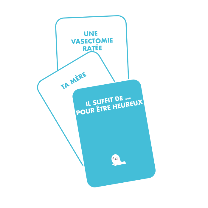
- Writing and selecting card content; playtesting to refine the tone.
- Creation of promotional visuals, hook strategies, and visual assets for Amazon and other retail outlets.
Results
Define a strong brand identity based on a simple name and concept
Develop a striking, humorous, and recognizable visual identity
Design a visually appealing and easy-to-read game
Create humorous content that remains engaging over the long term
Produce effective and attractive marketing materials
Position the game in a highly competitive market
This game is HUGE (like my * )! Okay, fair enough—to play it, you need a real sense of humor and shouldn't have a stick up your you-know-where. Just a heads-up: if you buy this game, you're going to have some amazing nights!!
Espritjeu.com
An incredibly fun game—provided you have a sense of humor, appreciate a bit of irreverence, aren't sexually frustrated, and don't get easily offended... As you’ve probably gathered, fits of laughter are guaranteed, though not with just anyone...
Amazon.fr
I got it as a Christmas gift, and I have to say, the game's title alone makes you want to play... The cards are really funny. I absolutely love it. I highly recommend it. It makes for a great night with endless laughs—and best of all, it’s exactly the kind of humor I love.
Fnac.com
Online Presence
More than just a game—a brand that tells its own story.
To support the game’s launch, I implemented a multi-channel communication strategy covering the website, newsletters, and social media. The goal was clear: to generate visibility, build a community, and drive sales through content that was consistent, impactful, and true to the game’s identity.
Site internet
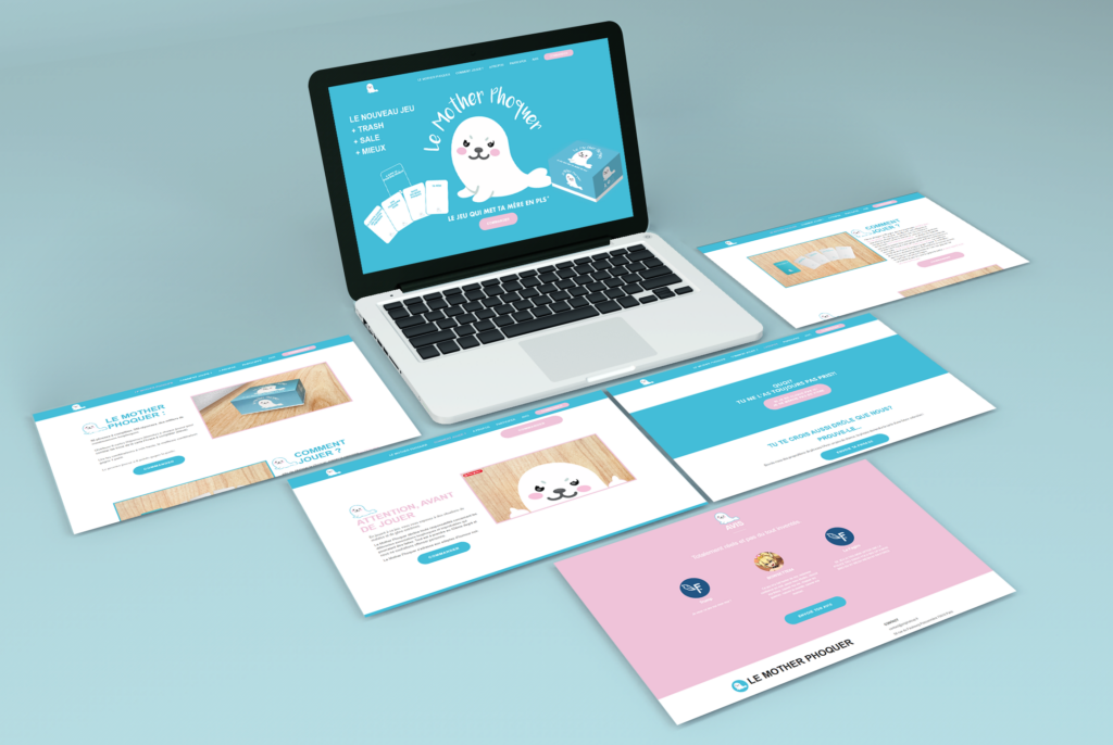
To support the launch and visibility of Mother Phoquer, I designed a single-page website aligned with the game’s visual style. The goal was twofold: to create a clear showcase for potential buyers while conveying the game’s quirky, eye-catching identity.
I worked on the site structure, the editorial tone, the integration of custom illustrations, and mobile optimization.
The site had to meet specific objectives: provide information quickly, offer visual appeal, and facilitate purchasing by redirecting users to sales platforms.
Particular attention has been paid to the user experience, featuring smooth navigation and a humorous tone that is perfectly in tune with the brand.
Newsletter
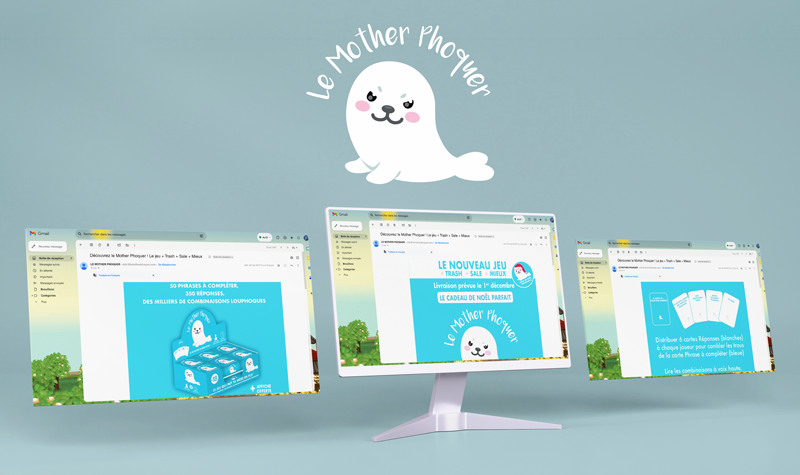
To maintain a connection with the community and drive the launch phase, I implemented a newsletter series aimed at players and partners. Each email was designed to extend the gaming experience, featuring dynamic visuals, a friendly and engaging tone, punchy headlines, and clear calls to action. I handled the copywriting, design, HTML integration, and testing. The goal was to maximize open and click-through rates while strengthening brand loyalty and engagement. These communications made it possible to showcase new features, gather player feedback, and keep the community connection alive.
Réseaux sociaux
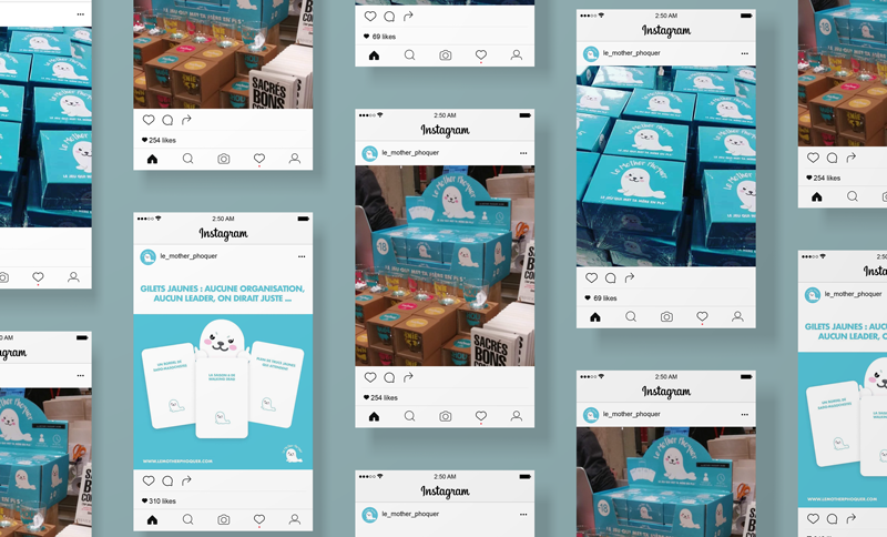
To support the launch of *Mother Phoquer*, I set up a dedicated Instagram page designed to serve as a vibrant showcase for the game’s world. The goal was to create a space that was both visually appealing and community-focused, allowing the product’s quirky, visual style to shine.
I developed a consistent editorial strategy, eye-catching visuals, and engaging content—ranging from card teasers and behind-the-scenes looks at the creative process to graphic humor.
This made it possible to capture the attention of a targeted audience, gradually establish a strong brand image, and generate interest well before the game’s commercial launch.
Giveaways and promotional items
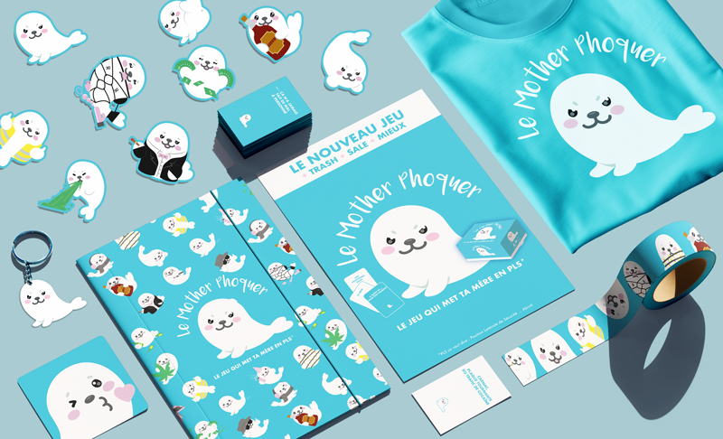
To round out the *Mother Phoquer* universe and boost its presence at events and in retail outlets, I designed a range of promotional items: stickers, flyers, tote bags, posters, keychains, coasters, and more.
Every item was crafted to reflect the game’s unique visual identity—a « cute » aesthetic that contrasts sharply with the adult content, designed to create an element of surprise and ensure instant memorability.
Each item served as a vehicle for word-of-mouth and a powerful brand touchpoint, helping to cement the game in the public’s mind.